This is the research log. In this section I will be improving my Photoshop skills and learn more techniques as I'll have to crate my final products using this same programme. The tasks that will help me to learn how to use Photoshop are; The audience recreation task, the textual analysis and the convention diagrams. The other tasks; the music genre task, profiling my audience, audience research and the moodboard, will help me to know my target audience's preferences to crate a music magazine that would appeal to them.
Recreation Task
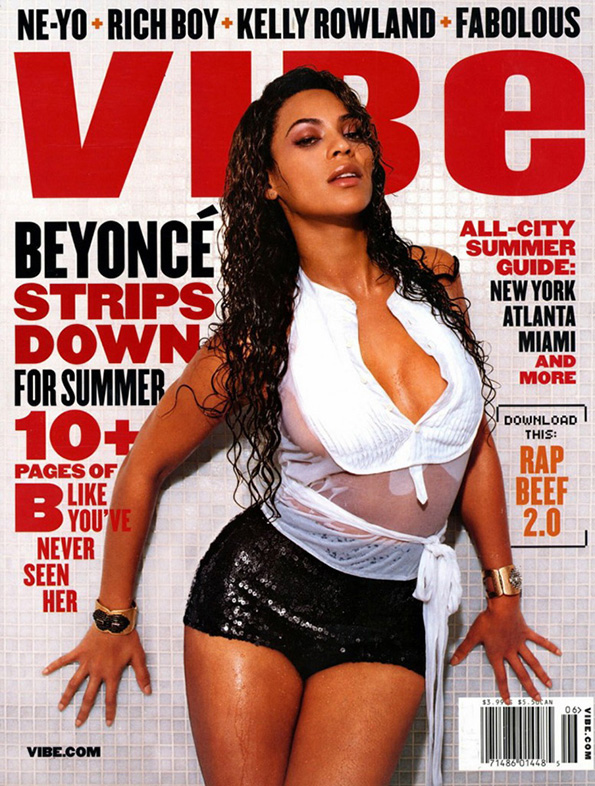
In this task I was asked to recreate a magazine cover by using a picture that we chosen and recreate that magazine cover with that picture. In my case chose this magazine in which Beyoncé is posing and recreate it by using this other picture of her by using Photoshop. It was a bit hard to recreate the magazine as the original magazine has the title behind Beyoncé's head and I had to do the same plus the another difficulty that was is to determinate the type of lettering they used in the original magazine. This task was very challenging.
|

|

|
Genre Of Music: R&B
My coursework will focus on R&B and Hip hop music as they are my favourite music genres. I love R&B music as it combines with elements of rhythm and blues, soul, funk, pop, hip hop and dance. I really love this genre as it's a combination of all the other music genres, its like a pack, all in one. I also love Hip-hop music as many of the R&B stars also are hip-hop stars. I grew up listing to this genres of music thing that I still do as I can spend all day listening to old Nelly, Drake and Rihanna's songs without even realising it.
|
|
|
Textual Analysis
Front Cover #1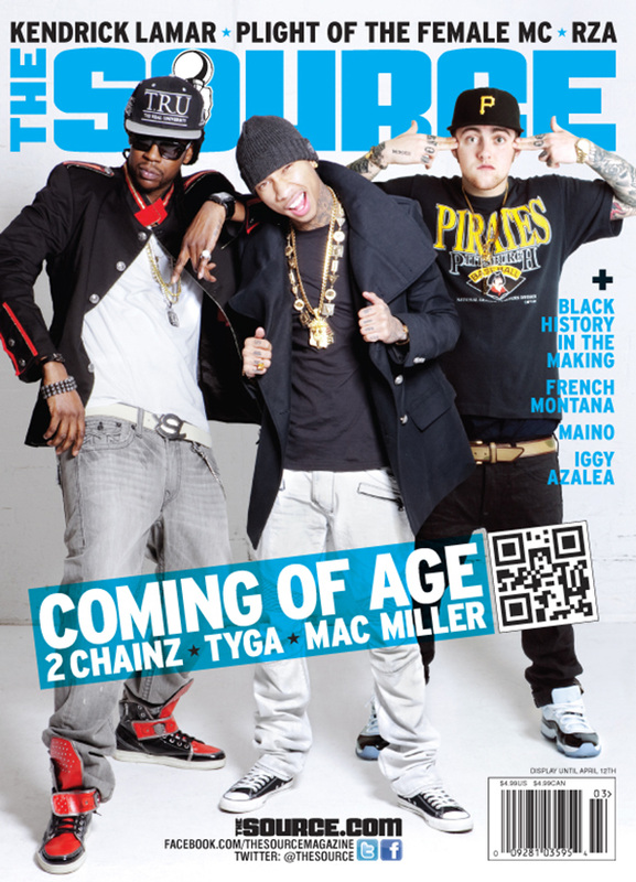
Mise-en-scene The cover of the magazine is a coloured photograph of three recognized rappers; 2Chainz, Tyga and Mac Miller this connotes that it's a hip hop magazine. CAMERA ANGLE + SETTING: It’s a long shot as it shows their entire body (head to toes) with a white background taken in a withe room. Thanks to this long shot we are able to see their entire costume and other parts of their Mise-en-scene. NVC: Tyga is posing for the camera looking directly to the audience with one eye semi closed and his mouth making some kind of curved smile showing his teethe. The NVC that he is making is very common in the hip-hop world. In his right 2Chainz is standing with an expressionless NVC as his just facing also staring at the audience with his black expensive sunglasses this portrays him as an attention seeker and mysterious. In the other side Mac Miller also with a expressionless NVC looking directly to the audience. They all look relaxed which portrays hip hop as an calm and mysterious music genre. COSTUME + PROPS: We are able to see their full costumes as this is a long shot, they all wear something black which connotes mystery, sternness and mischievous. Tyga's costume consists of a black beanie, some white jeans and his black combers which is weird as rappers like him tend to wear trainers; he is dressed in a very simple way. He’s also wearing a black jacket which he’s holding, like showing off his style; under that jacket he’s wearing a black t-shirt all this portrays him as modern and expensive dressing. Tyga's props are in gold; chains, his finger ring all this gold accessories connotes wealth and luxurious, he also has tattoos which connotes danger and mystery which is a stereotype for most Hip-Hop artists. Very similar looks 2Chainz as he's wearing a pair of lose grey jeans (typical of rappers, they never wear skinny jeans) and a white T-shirt which is under his black and red jacket and pair of black and red trainers which links to the jacket that he's wearing all this connotes that he's stylish and wealthy, he's also wearing a black cap which portrays him as dangerous and mystery. 2Chainz props are his sliver finger ring, his chains, the hand bracelet his wearing and the black watch his wearing all the accessories his wearing are common in the hip-hop world as many rappers dress similar. On the other hand, Mac Miller is wearing a very simple look that only consist of a pair of black jeans a black cap (many rappers wear caps) this portrays him as basic which is subverted stereotype of hip hop rappers as they all want to look expensive and extravagant maybe it's the fact that he's white (white rappers are not quite respected as black people think that hip hop belongs to the black culture). the black colour of his outfit he's connotes fear and mystery. and a black short handed t-shirt showing off his arm tattoos. He's also wearing a pair of white trainers. Mac Miller's props only consists of a couple chains and his tattoos again connoting that he's not that focused on looking wealthy like the rest. 

Detonation
This magazine cover consist of a coloured photograph of a very popular hip-hop rapper; Kanye West who is posing in a relaxed intimidating way. It's a mid shot as we are able to see half part of his body (head to hips). We can see the setting, props, the NVC but because of this shot we are only able see the top part of his costume. The background looks like one of those Marvel superhero cartoons. The masthead "XXL" is inside a read box which is positioned at the top right, at the back of Kaney's head, the last letter is covered by his head. The main cover-line is positioned in the middle of the magazine and it says "Kaney West" which is the character's name plus "Swagger like a roc star" which is in yellow. All the cover-lines stand out but the main cover line is the one that stands out the most as it has a black smoke around it. The bar code is in the bottom left of the magazine. Mise-en-scene This magazine is a mid shot of a very recognized hip-hop artist called Kaney West posing in a relaxed and intimidating way. CAMERA ANGLE + SETTING: Mid shot that only shows half part of his body as we are only able to see his head to his of the costume. It's also low angle as it's seems that we have to look up to see him and the way he is looking down to the audience he looks superior. The setting is edited as it looks like they took it form a comic. It consists of some realistic drawing of a Chinese city. COSTUME + PROPS: This type of shot shows only a part of his costume which consists of a black jacket that has some some details in read. Red is a colour that connotes blood and fear, so they use the same colour to the background drawings and the main header. Under that his wearing a grey t-shirt. He looks very cool and seems to be relaxed with his cool accessories, which consists of a single gold chain which connotes wealth , his sunglasses which connotes mystery and power it makes him look intimidating and dangerous. He's also wearing a white watch. All this portrays him as wealthy and dangerous which is a dominant stereotype of hip hop and it's artists. NVC: He's NVC looks expressionless which connotes mystery and no sense of humor, he also looks relaxed in the pose. Some how he looks angry and intimidating. Kaney is a artist that is also recognized for his serious and angry face expressions, seeing him smile is very uncommon and wierd. This magazine shows his actual, common face expression. 
|
Detonation The magazine cover consists of a colour photograph of three recognized rappers (Tyga, 2Chainz and Mac Miller). It’s a long shot that demonstrates their entire body (head to toes) with a white background. As I said we can see three hip-hop rappers Tyga in the middle, 2Chainz in Tyga’s right and Mac Miller in his left. All of them making different poses the photograph shows that part of 2Chainz arm is cropped as well as Mac miller’s left elbow. It seems that they are in some kind of white room so they didn't use a coloured background. The masthead “The Source” colour is a simple light blue and it is positioned at the back of the rappers heads. The “the” of the title is positioned horizontally on the magazine name. Also at the top of the magazine there is some extra information that might also be found inside the magazine. The names of the rappers are at the bottom of the magazine and it is also in a light blue colour linking to the masthead, the cover-line box says “COMING OF AGE” and it has their names under. Next to the cover-line there is a QR code this connotes that they want to make the magazine look modern. Under Mac Miller’s arm there is a plus sign (+) which tells us extra information about what the magazine contains and in this case there's written some other rappers names which connotes that this magazine only contains hip-hop music artists. The bar code is positioned at the bottom of the magazine under Mac Miller’s shoes, around that area there is also the website of the magazine, twitter and Facebook usernames. The magazine looks very simple as it doesn't looks messy like gossip magazines this portrays hip-hop as simple and clear. Typography
The magazine's front is large and bold which makes the magazine unique. The main colours are the light blue that they use in the masthead and in the cover-lines and the black colour they use to make the magazine stand out this also connotes that the magazine is targeted to the male audience more than the females as hip-hop itself is a male dominant music genre. The colour blue might connote swag, reconsignment or popularity, thing that obviously they have. The use of black makes the magazine stand out, this colous connotes danger which is another dominant stereotype of hip hop. They all look very relaxed and cool which connotes that the magazine might be about modern hip-hop. The main cover-line is in bold and it says "Coming of Age: 2 Chainz, Tyga, Mac Miller". This could mean that this three artist recently become really popular or the rappers of this generation. Beside the other main cover-line which is the QR Code which connotes modernity and technology advance which is happening around the rappers (they get to buy brand new phones... and experience things that normal people can't do or afford) this portrays hip hop artists as attention seekers and wealthy. Target Audience The target audience for this magazine might be for young people around the ages of 15-25 both male and female mainly male. This will appeal for people who are interested in the hip-hop, rap world. 

Front Cover #2
Typography
This magazine cover consists of a mid shot of a very popular hip-hop artist, Kaney West. This artist is recognized for his raps as his music focuses in racism and modern society issues. He's also popular because of his self confidence (some people might call him egocentric) as he believes that he is a superior human been, thing that they are trying to connote in the magazine cover as it's a mid shot which is in a low angle to make him look superior and intimidating. His pose also tells a lot about him, as he's standing straight with his hands touching each other in a malefic, confident way this connotes superiority and leadership usual characteristics that the media gives to men. The main cove-line is his name again connotes self esteem and the phrase "swagger like a roc star" which is ironic as his a hip-hop star and they are using another music genre, he's proud of him self, and he might think that he has the potential to be a rock star. The background is edited as it's a illustration of a Chinese city. His pose also influences the background giving it a danger look as he looks like he's a gang member thing that is a dominant stereotype of black hi-hop males. All the cover lines link as they all are similar; same colour and letter type. Target Audience The target audience for this magazine might be for people around the ages of 15-25 mainly for man. Also for people that is interested in the hip-hop, rap music genre. 

|
Double Page #1

|
Detonation
This is a black and white, also coloured double page spread of a famous r&b singer; Rita Ora. This double page seems to be a wide shot as we can see part of her costume ( the way she sites makes it difficult to part of her outfit). She is sited on the floor, lending on her knees this connotes that she's over confident and careless. The setting is a room as she is sited on the floor black and a white wall behind her the background might be edited in black and white to make the main image stand out. The double pages spread seems to be an interview with Rita as there is some text in the bottom the text type has a whit box behind it, to stand out and its written in two colours; read for the questions and black for response (typical magazine interviews layout). The read must be the interviewer questions and the answer is written down it. She is sited in the first page with her legs crossed and her right shoes appear on the other page. The headline is read, they used her artist name which is "RITA" (her name) in the first page and "Ora" in the second page ( her surname), they might used this red colour as it's her favourite colour and she always wears this colour for lipstick this portrays her as a provocative and fashion oriented women. The cover line seems to be painted on the walls but the fact that Rita is behind it makes it easier to recognize the editing. Mise-en-scene CAMERA ANGLE + SETTING: This double page spread consists of a wide shot of the singer as we are able to see part of her costume, the sting which is black and white room (they might edited the real colour of the room, and the lighting to make the artist stand out). But the artist photograph and the red headline and the red writing in the white box, this colour portrays danger. COSTUME: She is dressed modern also rebelling style as she is wearing a fancy leather black jacket and a pair of short denim ripped shorts which connotes informality and young, she looks sexually attractive in this outfit even if the short jeans are difficult to see because of the way she's sitting, lending forwards. It's also difficult to determinate her clothing under her leather jacket as her hand is holding her head and wearing a black beanie (common modern style) under her blond curly hair which is also hiding whatever that is under the jacket. She is wearing a very light make-up, the fact that it looks natural connotes self esteem and confidence. Her make-up consists of fake eyelashes, the fact that they are fake connotes insecurity and low self-esteem. The magazine represents her through clothing as she look cool and careless, she is young, talented and seems to cares a lot about her style, thing that is common in young society nowadays. NVC + LIGHTING: Her NVC looks confident and attractive at the same time, her head is slightly up looking straight to the camera with her mouth half open this connotes confidence, and careless. She looks relaxed in her pose this connotes that she is a tranquil person. She gives that image of coolness and swag. The lighting is obvious as the part in which she is sited looks brighter then the rest of the setting. |


|
|
Typography
This is a double page spread of a recognised R&B artist, Rita Ora. She's sitting on the floor in a edited black and white room this portrays her as dangerous and mysterious. This magazine uses this colour a lot as the main cover line which her name is also in red, as well as the interview questions. The way she's sited on the floor connotes that she's over confident and careless which is a dominant stereotype of R&B artists as they're less intimidating and mysterious than Hip hop this genres are very related as many artists of R&B also are Hip-hop stars (example: drake). The dps has a simple layout and structure which might connote her attitude as the R&B music genre is less violent and attention seeking than hip hop. Target Audience The audience for this magazine is for young adults ages 15-25 and people that supports her music and are interested in the R&B world. |

|


Double Page #2

|


|
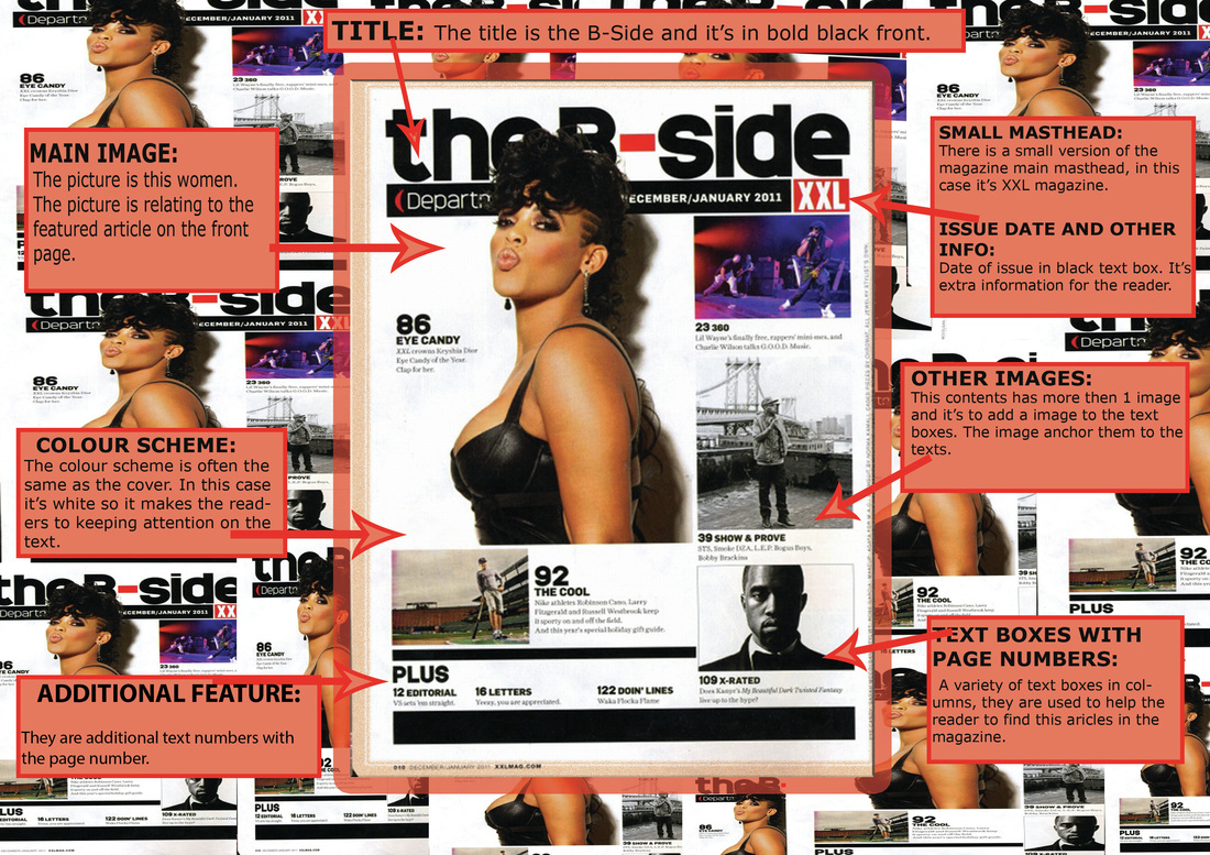
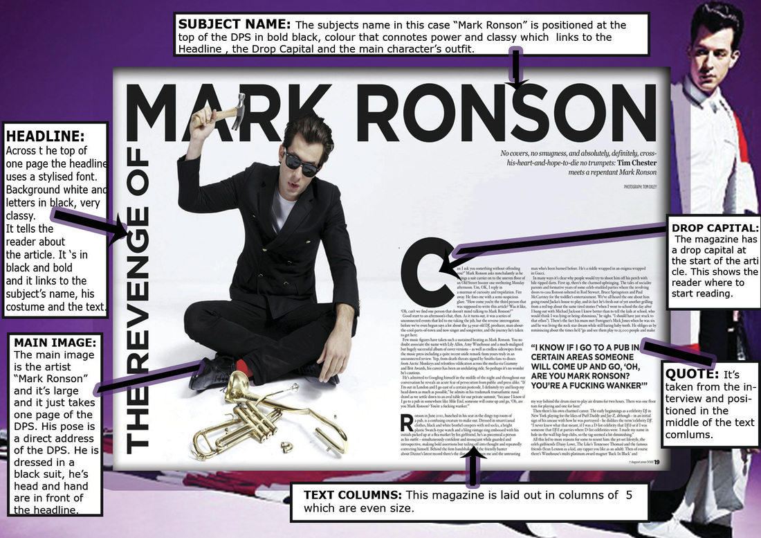
CONVENTION DIAGRAMS
This was the convention diagram's task. We had to chose one cover, contents and double page spread and analyse the different parts. I used Photoshop to create it and I had to put a background and explain the different parts of each.
As I mentioned in the introduction, this was the convention diagram's task and I had to chose one cover, contents and double page spread and analyse their different features and parts. I used Photoshop to create and I had to put a background and explain the different parts of each. This task was very creative as I had the opportunity to design the background for my cover which is the Katy Perry magazine. In my contents magazine I decided to duplicate the magazine into small copies and put them in the background. On the other hand, in my double spread magazine I decided to go to Google and find a background picture of the main image of the magazine which is the artist "Mark Ronson". I enjoyed doing this task as now I'm more experienced with Photoshop.
FRONT PAGE

CONTENTS PAGE
DOUBLE PAGE SPREAD
Profiling My Audience
This is the Profiling task and we had to build a demographic profile of my final magazine audience. Doing an audience profile is a key factor in helping us to produce our magazine. This helps me to know what type of audience we are attracting and they type of interests they may have that can relate to reading our magazines and what sort of features to importantly include to enable us to target our desired audience.
|
#1 R&B reader (female)
Name: Samantha Marie Brown. Age: 17 Occupation: A2 Sixth form student Gender: Female Ethnicity: Mix race; white British + black Jamaican. Nationality: British, Jamaican background. |

|
Personal Life
She is Samantha Marie Brown but she prefers to be call Sam. She is 17 years old and still in college, she studies at Christ the King Sixth Form and she’s in her last year doing her A2 hoping to pass her exams. She plans on going to a university outside the UK as she never been outside the UK, maybe in America, in LA and study Media, Beauty and Drama. Her dream job is to work in the E! News celebrities gossip programme as an interviewer as she loves the celebrity and gossip world.
She is Samantha Marie Brown but she prefers to be call Sam. She is 17 years old and still in college, she studies at Christ the King Sixth Form and she’s in her last year doing her A2 hoping to pass her exams. She plans on going to a university outside the UK as she never been outside the UK, maybe in America, in LA and study Media, Beauty and Drama. Her dream job is to work in the E! News celebrities gossip programme as an interviewer as she loves the celebrity and gossip world.
She recently lives in Deptford with her parents as she is under age, she still dependent on her parents, but not for long, as she says. Her parents are Jessica Bloom a white British women and Emanuel Brown a black British with Jamaican descendant, they are an interracial couple that has 3 kind including Sam. She has a part time job in M&S as she wants to buy her own car and save some money for her future plans.
Music
She loves R&B music as this music genre influences her life, from how she dresses, her makeup to who she hangs out with. She has over 5000 songs on her phone and most of them are from R&B singers like Rihanna, Beyoncé and Cessie. She grew up listening to big R&B singers like Nelly, Chris Brown and Kelly Rowland. She can really spend an entire day listening to the same music genre without realising it.


|
Fashion&Clothing:
Apart from music she also loves beauty. She watches YouTube beauty channels like “It'smyRayeRaye” and Carli Bybel’s channel, she loves Kyle Janner’s new beauty app and the show Keeping up with the Kardashians. She enjoys doing people’s makeup and she’s always on the latest fashion trends. |
Interests&Hobbies:
She’s a big fan of Iyaz and Mario and her celebrity crush is August and her favourite song is “Na Na” by Trey Songz. She would love my magazine as it's contains all the gossip and new trends she likes. It's a R&B music magazine which is her favourite music genre, so all the favourite R&B artists may appear on the magazine. She considers music, listening to music as her main hobbie as she can relax and enter in her own world. |
|
|
|
#2 R&B reader (male)
|
Name: Jessey Stevens
Age: 19 Occupation: Taking a gap year before uni. Gender: Male Ethnicity: Black, African american Nationality: American |

|
|
Personal Life
Jessey Stevens is a college student that is taking a gap year before he goes to university. He applied for NYU (New York University) and wants to study Music and become a R&B singer like Chris Brown or August. Another optional course that he's thinking on studying is drama. He loves R&B music and drama at the same time, he's dream job is to become a famous actor and maybe be one of the principal actors in the TV drama 'Empire'. He recently works at Starbucks because he wants to earn some money before uni and maybe buy a car. He is independent as he lives in a department with his friends in New York, but his hometown is Toronto, Canada. He wanted to be independent and explore the world apart from chasing his dreams and he thinks that New York is the place to start. He plans on taking a long term vacation and go to LA, spend his gap year there with friends and have fun and if he's lucky enough, be a DJ in a night club. He wants to enjoy this gap year, he plans on relaxing and maybe think more about his future and his dream career as he knows that it's very hard to be a musician or even to be one of the casts in Empire. |


|

|

|
|
Fashion&Clothing:
His fashion style is very modern and based in new trends. He wears what is popular and common on most occasions. He loves to spend time relaxing and just listening to music. Music: He has more then 200 songs in his Iphone and stills downloading more. He loves music and R&B music and the Weeknd is one of his favourite modern singers apart from August Alsina. He believes that modern R&B is way better the other music genres considering that Hip-Hop is another of his favourites. He loves Mario and wants to be a artist like him and maybe realise a remix of "let me love you" or "just a friend". |
Hobbies &Interests:
He loves my magazine as it's modern and fancy, it talks about all the r&b artists that he likes and looks up to. He loves all the articles and fashion tips in my magazine and also the fact that its all based on new trends and it also talks about recent albums of his favourite artists. He loves the magazine as the author motivates young people like him that wants to be in the music industry. He's sometimes the DJ of some prestigious night clubs, he loves to dance and spend time with friends filtering with older girls, and furthermore watch movies as he thinks that it could help him to improve his acting and even singing skills. |
|
|
|
AUDIENCE RESEARCH
This is the audience research task. Here are my 20 questions that I had made and asked to some friends and family. This task will help me to label and format my magazine in the way my audience will be attracted to. I had to provide three forms of social networks, I decided to send the questions to my friends through Whatsapp, survey-monkey and Facebook and gather my results into pie diagrams and bar charts.
Questionnaire
Front Cover
1. What layout do you prefer for the front page?
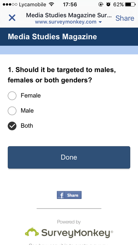
2. Should the magazine be targeted to Females, males or both genders?
3. How many cover lines should be there?
4. How many people should be on the cover?
5. What NVC style should the main image do?
6. Should I include a QR code?
7. Should the main image be of a man or women?
8. Should there be a quote of the person featured?
9. How much are you willing to pay?
10. Should I include a left third and selling line on the front cover?

|
|
This results graph shows that my target audience prefers the Billboard magazine layout. They many people liked this structure as the cover lines are in the left side of the magazine making the magazine clear and easier to understand. They like this as the main artists photo stands out in it self and also the fact that the masthead and main cover line are in white bold so people can easily recognize the magazine. Personally, I like this layout as it's very clear and simple which is one of my main purposes as my target audience wants the magazine to be more visually attractive then text based like the "Q" magazine and typical gossip magazines layout.

|
|
This results graph informs me that my target audience wants the magazine to be targeted at both genders. They want this as both genders are interested in R&B which is a music genre that both genders can be attracted to, this gender is not like hip-hop which is a patriarchal music genre as there are more male artists and listeners then females or Pop where is more matriarchal (more females than males).

|

|
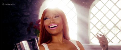
This pie chart shows that my target audience wants my main image to do the duck face, by Nicki Minaj in the picture, as they think that it's cool and modern as nowadays people choose to do this NVC style when taking a picture, so to meet new trends my main image will do the Duke face. The pie chart also shows a tie between the NVC number 3 (Rihanna showing teeth) and NVC number 4 (Kyle Jenner, sexy expressionless NVC). This tie was because this two NVC's are very popular in the R&B/Hip Hop world so they wanted something traditional.
Contents Page
11. How many people should be in the contents?
12. How many text boxes and columns should I do?
13. Should the contents be more visual appealing or one with a lot of writing
14. Should I include other images?
15. Should I put a small masthead and the issue date?
12. How many text boxes and columns should I do?
13. Should the contents be more visual appealing or one with a lot of writing
14. Should I include other images?
15. Should I put a small masthead and the issue date?

This pie chart shows that my audience wants the contents page to be more visual attractive than text based like the example 1.This is due because they want the magazine to be modern and attractive as they will not have time or the patient to go through every text box, they don't mind not having an editor comment or additional contents text that they will eventually find on the magazine. They want the main image to stand out and maybe occupies the entire page with some text boxes.

|


|
|
This green pie chart shows that my target audience wants two people in the contents page. This might be because they want the contents to be more visual appealing than text based so they would want more than one person to make the contents stand out and be more visually attractive like the example 2.
|
Double Page Spread
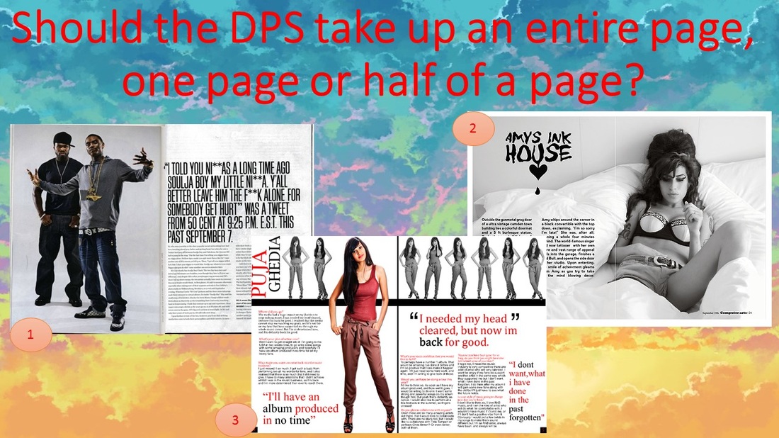
16. Should the DPS be a Q&A or a simple article?
17. Where should the image of the artist be oriented?
18. Should the main image take up an entire page?
19. Should the main image be of a male or a female?
20. Should I start with a drop capital? and how many text boxes should be there?
17. Where should the image of the artist be oriented?
18. Should the main image take up an entire page?
19. Should the main image be of a male or a female?
20. Should I start with a drop capital? and how many text boxes should be there?
|

|
This graph shows a tie between example 1 and 3 as one half of my target audience wants the double page spread to occupy and entire page like the example adobe as they think that it looks better as the image stands out on it self as well as the text on the other page, they think that it's more clear and simple. On the other hand the other half wants the dps to take half of the page as it looks professional.

|

|
This graph shows another tie as one part of my target audience wants it to be an article as they find articles more informative and relevant which is a thing that I like as I want the magazine to be informative. However the other half wants an interview (Q&A) as they find them more personal which is another thing that would like to provide as I find Q&A's more relevant and direct.
+Evidence

|

|


|
+Additional graphs

This graph shows that my target audience wants my main image for the contents page to be positioned in the middle of the magazine as they think that it would stand out more than the text boxes as they want the contents page to be more visually attractive than text based.
|
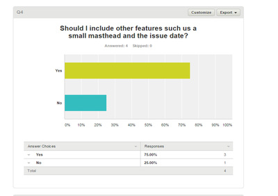
My target audience wants the contents page to have the issue date and the masthead on the top of the page. They want this features as they think that it will make the contents more informative and it will tell the reader the name of the magazine and the date it was published.
|

This graph shows that my target audience wants a QR on my front page as they think that it will make the magazine look more modern as that's what they want. They also wanted a link of the magazine's website, Facebook and twitter as some readers would like to know better about the magazine and it's a way to promote the magazine.
|

I made this question to see if people would buy the magazine even if it costs more than a pound and they agreed, with the condition that it should be informative and relevant as many of my target audience are minors that depend on their parents so the price should be balanced.
|
Evaluation❣
My results showed that my target audience wants the magazine to be targeted at both genders, they are willing to pay more then £1 as long as it entertains and gives them the information they want. Also the results showed that my audience prefers the billboard magazine layout as its clear and easy to read and they want the main image's NVC of the front cover to be similar to the "duke face" of Nicki Minaj, many also wanted the main image to wear teeth grills as Rihanna in the suggestions. Also they wanted a QR code on the front cover and a selling line to attract more people attention to buy it. On the contents page many people wanted it to be more visually appealing then text based. They also wanted it two people in the contents and they wanted text boxes with number s it's easier more neat and clear, furthermore they wanted a small masthead and a the issue date. On the Double Spread Page many friends wanted the main image to take the 2 entire pages also they wanted it be an interview (Q&A) as it's more personal and for people like Jessie (audience profiling) they will benefit more with a Q&A then a normal article.

MOODBOARD
This was the moodboard task. I had to create a moodboard based in my magazine gender which is R&B (Rhythm & Blues).

I enjoyed doing this task as I had the opportunity to make a moodboard of my favorite music genre using pictures of my favorite R&B artists. I used Photoshop to create it and I must say that Photoshop is the best editor as I think that this is the best task that I ever made using Photoshop editor. My genre is R&B so I took pictures of my favourite artists of this genre also I took some props that relate to this music genre, I wanted the colours to be gold, silver and black as those are my magazine theme colour.
RESEARCH VIDEO LOG
This is the research video long. In this task I made a video explaining the process of crating my research stage page and the process of doing all the tasks and how well it went.
